Voigtländer Color Skopar 21mm f3.5 VM review

Introduction

It seems that i always end up reviewing non-Leica lenses for the Leica M mount. Maybe that is because i think that these kind of reviews are more exciting. When you want the best no compromise lenses for your M the native Leica lenses are the gold standard. They are that good and you can hardly find anything wrong with them.

The more interesting question, i think, is how good are the alternatives. They all are less expensive and that is a good thing to begin with. The lens i would like to write about today is the Voigtländer 21mm f3.5 color skopar that was just released for Leica M.

Mind you, there is also the Sony E mount version available which was released earlier. While that version seems to have the same optical formula (9 lenses in 8 groups, one aspherical element) results may still vary.

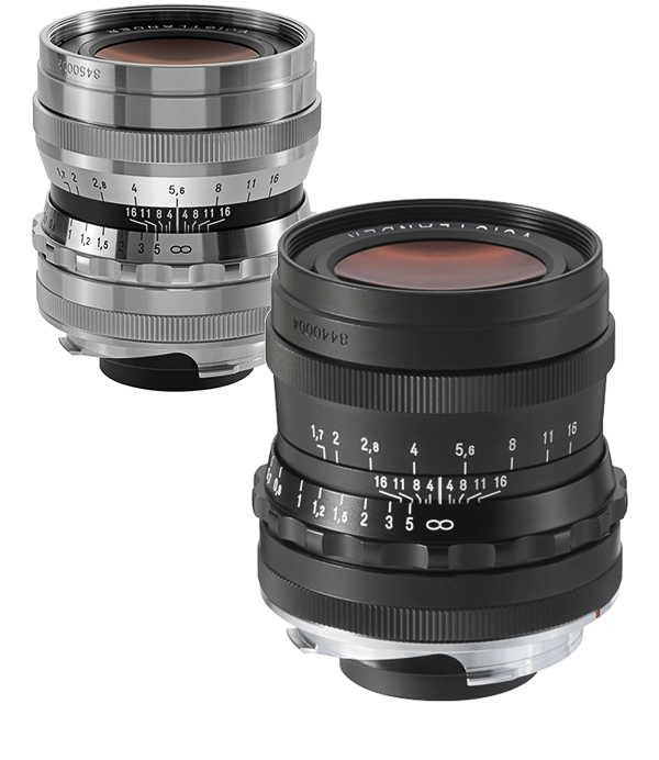
There also exists a 21mm f4 color skopar (still available today) which was never designed for digital and produced a color cast not visible when shooting film. This 21mm f3.5 was made for digital so lets find out how it fares.

Design and build quality

This lens is from Cosina’s vintage line and its appearance really reminds me of lenses from the past. It is a full metal construction. The chrome parts are a bit too shiny for my taste but other than that i really like the way it looks and feels in the hand. The lens is tiny. It weights in at 180g and measures only 30mm in length. It also takes common 39mm filters.

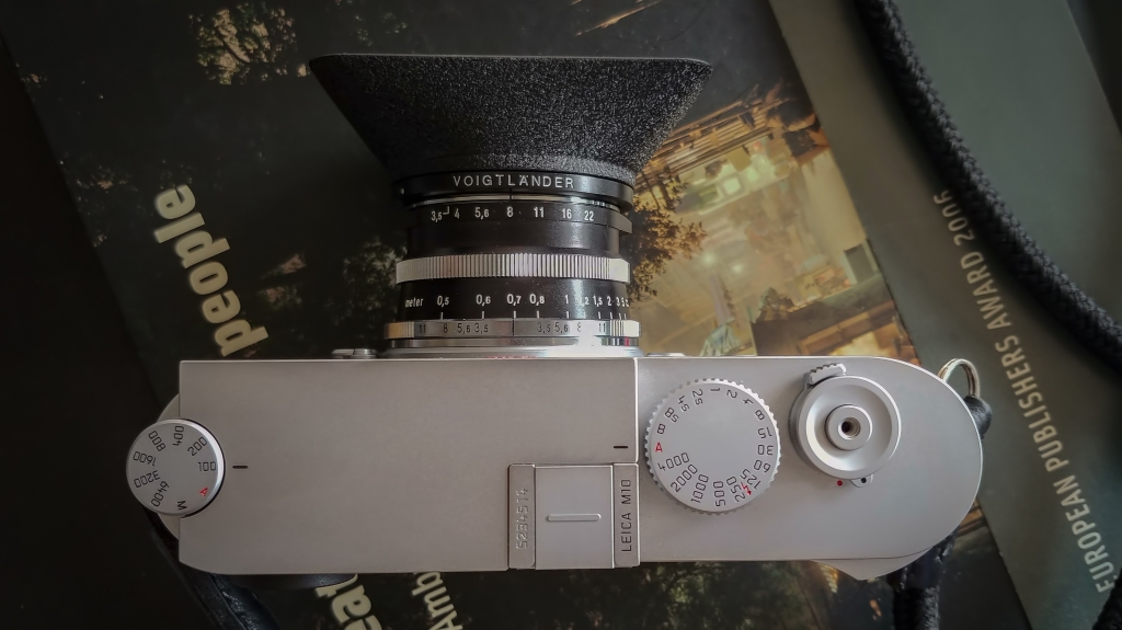
The focus ring runs smooth as does the aperture ring. Each aperture clicks firmly into place and stays where you put it (f3.5 to f22 in half stops). There is no de-click option for the M mount version.

The lens features a focus tab to help finding perfect focus. The minimum focus distance is 0.5m.

Markings are engraved on the full metal body and filled with color. There is even a dof scale. That one is harder to read though.

Overall build quality is very good and on par with other recent offerings from Cosina Voigtländer. The lens cap really is the only thing that feels cheap but it does the job and won’t fall of easily.

The retro style lens hood (LH-11) is not included in the box. It is also full metal and reminds me of the one that comes with the latest Leica 28 Summaron lens. Because of it’s size it blocks the viewfinder quite a bit. Most people probably prefer to use an external viewfinder or live view anyhow, so this will not bother them. With some practice it is still possible to guess the frame with very good results just by using the optical viewfinder.

The 21mm Color Skopar (old and new) is not a fast lens but it makes up for that with its compact size and the ability to take screw on filters.


Optical quality

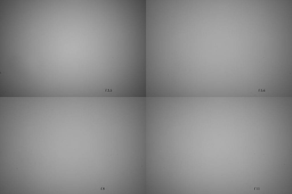
Even though this is called a f 3.5 lens the actual light that hits the sensor suggests, that is more like a f 4 lens (like its predecessor). Wide open there is some vignetting. At f5.6 it is less pronounced but even at f11 there is still some left.

The sharpness and contrast is already very good at f 3.5. In between f 4 and f 11 the images have the most resolution. In real life you can hardly tell a difference but the optimum sharpness is reached at f 8. While the center sharpness is always on a impressively high level, the borders are not as sharp but only the extreme corners suffer so much that it becomes obvious. About 95% of the image has great sharpness no matter what aperture.

Diffraction kicks in at f 16 and i would not use f 22 when highest resolution is important.

Contrast is on a high level right at f 3.5 and does not improve much when stopping the lens down. I would say its about perfect. To much contrast is not what you want from a lens. Micro contrast is also on a high level especially in the center of the image which creates an impressive perception of sharpness, depth and detail.

It becomes very clear, that this glass is made for use on digital cameras when you compare the colors that it produces with its predecessor. First of there is no visible color cast and you dont need to set a lens profile in the camera. The lens works perfectly fine without any profile that might take care of optical imperfections, except vignetting.

Colors are just beautiful and more in line with what you would get from a Leica lens. That is probably the biggest achievement. But not only that, the out of focus parts are also looking very organic and the is no harshness that would disturb. Not that there is much out focus with a 21mm lens. With its minimum focus of 0.5m you dont get much bokeh but the little there is looks very good.

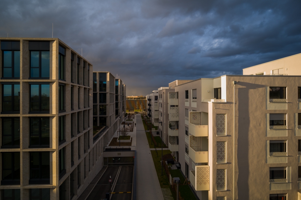
Distortion is on a low level. If you need straight lines (e.g. for your architecture shots) you get them. In the lab you will find that there is a tiny bit of barrel distortion almost unrecognizable in real world images. Chromatic abberations are on a low level as well.

The ten aperture blades create nice looking sun stars.

Negatives ? Well, sharpness in the extreme corners of the frame could be better as i have mentioned and the lens hood might look cool, but also blocks the view thrue the viewfinder. Other than that there is little to critcize. The vignetting should not bother you too much (and can be corrected in post of course). The lens is not your best choice if you need to shoot in low light situations (t-stop around f 4) but other than that its a fine glass.

Conclusion

Voigtländer always produced high quality lenses. Most of them worked perfectly with film, sharpness seldom was an issue. Color and overall rendering (harsh busy bokeh) has been more of a let down. But it seems Cosina has been focused to improve especially in these areas and they have been successful, not only with this new 21mm lens but also other recent offerings (see the fantastic 50mm f3.5 lens for example).

Color cast is not an issue on a Leica M, instead colors are very pleasing and more in line with Leicas own offerings which is great. The out of focus areas are soft and non disturbing and the transition is smooth creating very natural looking images. Yes, there is a little loss of resolution in the extreme borders of the frame (and i mean extreme borders) but in real world use that is no big deal. I really dig this tiny lens and i will keep it for my personal work.

Price: 799,- Euro or 799,- US dollar. Lens hood (LH-11) not included (99,- Euro or 99,- US dollar)


Voigtländer VM 35mm f1.7 Ultron asph. review (for Leica M)

35mm_f1_7_ultron

Image Property of Voigtländer

In the end of 2014 i did a review of the Zeiss 35mm ZM Distagon and it turned out that this was a great lens. Now, about 9 months later, i have the chance to write about another alternative for the M mount.

Ultron 5

Open day at the DLR near Cologne – click on all images for best quality (one click large, two clicks 100%)

Introduction

It took me quite a while before i first tested a non Leica lens on my M. There was little reason because i was always happy with Leica. Shure these lenses are pretty expensive but you get what you pay for and they hold up in value very well. Still there are good and more reasonable priced alternatives out there on the market.

While Zeiss was always known for quality glass with its own optical character Voigtländer seemed to be a bit behind, both in terms of build and optical performance. But like in the car industry times are changing and new products from less renowned companies surprise us. So after hearing good things about the new Voigtländer Ultron i thought it would be time to give it a try.

Ultron_3

Exposed aero engine, CV 35 Ultron asph. at f 6.8 – nice 3D pop

Build quality

Note that i can only speak about the chrome version of the lens which is made out of brass. There also exists a black version that is made of aluminum. I went for the chrome one because i thought it would look cool on my M and i loved how the latest edition of the 50mm Nokton looks like. In fact the Nokton and this lens are very comparable in look and feel.

The chrome version of the Ultron is noticable heavier (330g) than its black sibling (238g). Both are well made but maybe not on par with Leica glass (or Zeiss for that matter). The aperture ring is solid and smooth at the same time although the focus ring feels a bit harsh in comparison. There is nothing wrong with it, it is just how it feels to me after shooting Leica lenses almost exclusively. The filter thread has a size of 43mm which is uncommon for Leica mount. The lens is quite small with a length of 50.6mm and comes shipped with a (screw on) metal lens hood. It feels very dense and solid in the hands and works just fine.

Ultron_4

 Tail fin, CV 35 Ultron asph. at f 5.6 – nice color and tonality

Optical quality

Now the question is how well compares the 980 US dollar Voigtländer lens to the rivals from Zeiss and Leica ?

The new Voigtländer starts with a 1.7 aperture and wide open it is very compareable to the fantastic Zeiss in terms of sharpness. Overall performance is improved when stopping down and from 2.8 on it is as sharp as it gets, even on pixel level and even in the corners of the frame. Micro contrast is also on a high level but i usually like to add a bit clarity in post.

Colors look very true to life with this Voigtländer lens. I had my problems in the past with lenses from that company but this one is on a new level. Even better than the 50mm Nokton 1.5 asph. (which was already a step forward). The lens shows no visible focus shift also. Well done.

Ultron_1

Imperial troopers with hostige, CV 35 Ultron asph. at f 1.7 – sharp even wide open

The lens has a good flare resistance when you shoot against the sun. At small apertures and in very contrasty scenes you can find color fringing occasionally. In most shooting situations you will see none. With its ten aperture blades it easily creates nice looking sunstars not only at f 16. The overall rendition is very organic with just the right contrast. Bokeh is also pleasing for a 35mm lens.

Ultron_2

DLR facility, CV 35 Ultron asph. at f 6.8 – sharp from corner to corner

At f 1.7 there is visible vignetting. That is expected. It goes away when you stop the lens down. In actual photography it will not be an issue but when you shoot white walls this lens shows also a minor magenta color cast in the corners of the frame. I coded the lens as a 35mm Summicron asph. and it helped (see images below).

Ultron_Coding

White wall, CV 35 Ultron asph. at f 1.7 – Image 1 uncoded, uncorrected,  Image 2 coded, corrected in LR              

If you are sensible to distortion and want straight lines right out of the box, here is good news. Distortion is on a very low level and the little there is can easily be fixed in LR if you want perfection.

The bottom line

The Voigtländer VM 35mm f1.7 Ultron asph. is a strong performer. It is sharp, has good color and contrast, a nice bokeh and handles nicely. It is not a f 1.4 lens like its more expensive competitors but that does not matter much to me. With its compact size it feels very balanced on a Leica M and it also does not block the view finder much. It comes with a lens hood and a three years warranty (in Europe) for a very reasonable price. What is not to like ? Highly recommended.

Ultron 6

Landing gear, CV 35 Ultron asph. at f 1.7 – another example of a shot taken wide open

If you want to follow my blog for more articles in photo you can do so by hitting the follow button. Thanks for reading.

Replacing the Leica M9 with the Leica M – why it was worth it for me.

Hello dear readers of my blog,

i just wanted to share my thoughts on the Leica M and explain why it finally replaced my M9. The reasons might be interesting if you wonder if it is worth it for you, too.

This is no review of the camera. I am not going to repeat what others already wrote about the Leica M. Instead i want to explain what matters to me and why i finally bought it.

When you have read what i wrote under “My gear” you know that i love the M9. So much, that i thought i would never replace it with the M. I still think that in terms of pure image quality (at base ISO) nothing beats the M9. Pictures in fact have a very unique look that i am a big fan of. But images from the M9 are not (technically) better than those coming from the M. They are just different.

So the biggest difference between the M9 and the M is of course the sensor (18mp CCD sensor on the M9 versus a 24mp CMOS sensor on the M). And while CMOS brings many advantages like live view, focus peaking, better high iso quality, etc., i totally understand people who prefer the CCD sensor – not only in Leica cameras. In a market where almost every consumer camera has a CMOS sensor, CCD stands out. I sometimes find it hard to distinguish a picture from a Sony A7 combined with a Leica lens from one that was shot with the M and the same lens but i can always tell when the image was shot with the M9 (or M8 for that matter).

I prefer colors from the M9 and i believe that is due to its CCD sensor. Out of camera jpegs never impressed me though on the M9 and the M has the edge here if that is important to you. So better shoot RAW on your M9. Shure the M has much better dynamic range. There is more room to work with your shadows and highlights in post.

There is a debate going on wether the M9 files are sharper than the M’s and to me the M9 files indeed do look sharper on screen. But comparing images on screen is problematic. The more resolution your camera has the more compressed they show on screen and even looking at 1:1 pixels is not a fair comparison because the higher the pixel count the higher the magnification. What i can tell is, when you downsize the images to match screen resolution before you export them results from the M are great and compareable to those from the M9 in terms of sharpness. And if you print, you will be very happy with your results. Here the extra resolution can be a big plus depending on the size of your print.

I think that the combination of modern CMOS sensor and higher pixel count on the M makes it worth shooting it with the best lenses out there. In my opinion the camera shows the differences much clearer than the M9 did. Images from the 50mm Noctilux 0.95 look at least as good on the M. Same is true with the 90mm Summicron APO for example. Other lenses, especially older ones, dont come to life in the same way they did on the M9. So older lenses work better on the M9 while the latest lenses help the M especially in terms of color rendition and overall look and feel. Images then have the same pop and 3Dness that you love on the M9.

Apart from that the M is indeed a worthy successor. I mentioned the expanded dynamic range that i appreciate, the better low light performance, better ooc jpegs and that is not all.

The build of the M is superior (but not by much cause the M9 is already among the best). For example the little wheel on the back of the M works better for me than that on the M9, both when you review your pictures and when you move around the menue. The buttons also feel more responsive. You will notice the exta weight of the M though and the little thumb rest does not help much to hold the camera safely. I used a Thumbs Up on the M9 and it is a great tool on the M as well. The extra Leica hand grip might be worth it for you but i prefer to keep the system as small (and light) as possible.

The new shutter is smooth and very silent. Definetly an improvement here as well. The display is higher resolution, which combined with live view (and/or focus peaking) is great. If you shoot lenses wider than 28mm you still can see what is in the frame. A big plus if you don’t want to carry extra view finders. Working with filters is much easier now, too, because you can see the effect in live view. The battery life is also much improved and the body is even weather sealed. As i am much into outdoor photography i appreciate the M for that.

Last not least my M9 had sensor problems twice in three years and needed a repair twice. This might not be the biggest issue in the world but having a sensor that is free of corrosion is a good thing.

So for my type of photography the M is the better camera. Yes, the difference in output is definetly noticeable and not everybody will prefer the M but it also features a lot of improvements that make it a better package for most, especially when you are into landscape photography and work with wide angle lenses and filters.  And it is still a true Leica rangefinder camera that works perfectly well with almost any Leica lens ever made. Photos to showcase this will follow so keep coming back for more.

Thanks for reading.

Zeiss Distagon 35 1.4 ZM Review (on Leica M9)

I was lucky to get the chance to test the all new Zeiss Distagon 35mm f1.4 ZM for a couple of days. While it is not officially released, it will be available pretty soon and it is eagerly awaited. Mind you, the images shown here are not made with any aesthetic claim in mind. They are just examples to show the optical characteristics. These from RAW converted JPG’s have either none or only minor adjustments in post. I also express my personal opinions here solely. Your experience might be different. With that out of the way, lets get started…

Leica M9 and Zeiss Distagon 35 1.4 ZM - click on image to enlarge
Leica M9 and Zeiss Distagon 35 1.4 ZM – click on image to enlarge

Introduction

I have to admit that i love the rendering of Leica lenses on my M9 camera and i never owned or even shot a Zeiss lens before. I even decided against an upgrade to the M type 240 because of its cmos sensor and the more modern look this camera produces. But the hype for this new lens model is tremendous and so i was very excited to see how i would like it. Leica lenses are famous for their optical quality. They are almost flawless in actual use and very well build. They render images with great detail, nice color and contrast. Especially some older Leica glass adds some kind of glow that many people love. Pictures also appear to be very vibrant with great transition from focus to out of focus parts. But Leica lenses are also famous for being pricey, especially when it is fast glass. The latest Leica 35mm Summilux with its floating elements costs 4200 Euro. This Zeiss alternative is expected to cost around 2000 Euro. That is not even half the money. So how good is it ?

Build quality

The Zeiss lens weighs 381g (13.4oz) and is 87mm long with a 49mm filter thread. This is larger and heavier than the Leica counterpart which weighs 328g and is 48mm long with a 46mm filter thread (both with no lens hood). When you mount the lens onto your M9 (or M240) it gets front heavy but in the hands this is not a problem at all. You will also see some finder blockage, even without a lens hood. It is not too bad though and it did not bother me after a few frames. Build quality is top notch. The Lens is made in Japan. Only metal, glass and paint. The filter thread is made of shiny metal which i personally dont like that much. You may think different. I wished i had the lens hood that you screw onto it but it was not available yet. The lens will not ship with a lens hood. You will have to buy it seperately.

When you set your aperture you will notice the nice feel of the aperture ring. It runs smooth and each aperture (in third stops) is confirmed with a solid click. No harshness in the focus ring also. There is no focus tab like on many Leica lenses but the ring is fluted to grip on. It is actually a joy to focus the lens. The way from close focus (0.7m) to infinity is just right. Long enough to be precise and short enough for fast action (like from 5pm to 8pm on a clock). While Zeiss claims you can’t focus closer than 0.7m you can go beyond that point and my M9 focusses perfectly to 0.6m. Very nice. The lens also features a internal focus mechanism which is also nice and should help to protect the glass from dust and other nasty stuff getting inside. What i noticed is that i liked the lens cap better than what i know from my Leica lenses. You put it on and when you give it a litte push, it clicks onto the lens and will not fall off accidentally. While Leica has its FLE to eliminate possible focus shift i cant tell you what this Zeiss has instead, but i can tell you that i did not notice any focus shift. Perfect focus at all apertures and distances.

Optical quality

Sharpness is not much of an issue nowadays. This new Zeiss lens is no exception. But where other glass tends to get soft wide open or at the corners of the frame this Zeiss delivers. It has great sharpness right at f1.4. There is only a little improvement compared to f4 where the lens has its optimal sharpness. Even extreme corners are sharp wide open. In the lab you will find that it gets better stopping down to f4 but again the difference is negligible.

Zeiss Distagon 35 1.4 ZM at f4 - click on image to enlarge, click twice for 100%
Zeiss Distagon 35 1.4 ZM at f4 – click on image to enlarge, click twice for 100%

Color and contrast are on a very high level also at f1.4. Again it will improve only a bit stopped down. Very impressive. Diffraction is visible at f16 where the image gets softer.

Zeiss Distagon 35 1.4 ZM at f16 - click on image to enlarge, click twice for 100%
Zeiss Distagon 35 1.4 ZM at f16 – click on image to enlarge, click twice for 100%

Speaking of color and contrast i would say that this Zeiss is on the higher contrast side and colors are vivid. The images are slightly on the cold side on my M9 but that is something you can easily adjust to your liking in post.

ZeissDistagon 35 1.4 ZM at f5.6 - click on image to enlarge, click twice for 100%
ZeissDistagon 35 1.4 ZM at f5.6 – click on image to enlarge, click twice for 100%

The lens vignetts heavily at f1.4 which is expected. This is also easily corrected in post. You can set the lens profile in camera manually to match the Leica Summilux asph and vignetting is almost gone completely. That is what i did. Other things are not corrected this way but there is not much to correct anyhow. I saw no strong distortion or other optical flaws like chromatic abberations that needed a fix. Again very impressive.

Zeiss Distagon 35 1.4 ZM  at f1.4 - click on image to enlarge, click twice for 100%
Zeiss Distagon 35 1.4 ZM at f1.4 – click on image to enlarge, click twice for 100%

Even though we are talking about a wide angle lens, bokeh is easily created. Of course you dont get that totally blown away backgrounds, but it’s there and it helps to isolate your subject. I found the bokeh to be good but not great. The transition has not quite the same depth as i saw it in the 35 Summilux and while it is far from being busy it does not seem to have the same creaminess the Summilux delivers. Still the Distagon has great pop and 3d ness which Zeiss lenses are famous for.

Zeiss Distagon 35 1.4 ZM at f1.4 - click on image to enlarge, click again for 100%
Zeiss Distagon 35 1.4 ZM at f1.4 – click on image to enlarge, click again for 100%

The bottom line

The Zeiss Distagon ZM 35mm f1.4 impressed me. It has high contrast and sharpness that matches or exceeds its rival, the Leica Summilux FLE on these points. Wether you like the higher contrast or not is a different story though. Build and handling is great, especially focussing was a breeze. You get some finder blockage but in real use it did not bother me at all. Mind you this is with no lens hood attached. Size and weight are not a problem also, at least for me. The Summilux is still noticeable smaller and lighter and has less finder blockage. Rendering is different also. While i prefer the bokeh coming from the Summilux, this Zeiss is not far behind and the differences in color are more a matter of taste than a matter of quality. This new Zeiss has a lot to offer and even might be your first choice, especially for the money. I can highly recommend it.

If you want to follow my blog for more articles in photo you can do so by hitting the follow button. Thanks for reading.

Colors of the Sony A7r – dealing with RAW files.

I have my Sony A7r now for a few weeks and i am still learning how to get the most out of it. It is an amazing camera but handling the RAW files in Lightroom is tricky.

I only shoot RAW. I am the kind of guy who likes working on his images. For me, it is just as enjoyable as shooting. But when i learn about a new camera, i also shoot JPEG. I want to see what the camera does inside when processing the JPEGs and i always liked what the Sony showed me on its display when i took a shot.

Well what you see on the screen is a processed JPEG and that is far off from what you see in your RAW files. That comes naturally one might say, cause these JPEGs are sharpened, have a color and contrast boost and other stuff applied. But even in standard mode with no filters applied the colors from the Sony JPEGs looked so much better than what i could ever get out of my RAW files. The reason for this lies in the camera profiles. These profiles make a hughe difference in color representation and all your color adjustment in Lightroom is based on these profiles.

But Adobe did only a fair job with the Sony A7 profiles. No matter which one you choose, you are no way near to that gorgeous looking colors from the JPEGs. Unless you did not change it, you start processing your RAW files with the “camera standard” profile. The color you get looks ok but it is just not right.

This is an unedit RAW file and how it looks with “camera standard”.

Camera standard-1

When you change your profile to “camera vivid” you get closer to the standard JPEG but it is over saturated.

Camera vivid-1

I searched the internet to see if someone already created a better profile than what Adobe offers and i found this site

http://www.piraccini.net/2011/02/profili-colore-sony-a900-per-adobe-lr.html

Maurizio Piraccini did lots of profiles not only for Sony cameras, so you might want to visit his site. When you download his profiles you get many new choices in Lightroom and i ended up using “Faithful” as my basic camera profile. Even though it is not perfect, it is a good starting point and while it can look a bit flat without editing, you get rich and natural colors with a slight move of your saturation slider. Something you wont get with the in build profiles.

This is how the image looks with “Faithful” no editing except slightly saturated (+10). It is much closer to what i saw that day taking the picture. The leaves have exactly the color i remember and the sky was as blue as this.

faithful saturated-1

These images are examples only to show how big the differences are and how important it is to choose a profile that you like. You can of course make your own profiles for Lightroom. Adobe has a special tool for that purpose.
Thanks for reading.

Creative color adjustments for Urban Landscapes

I spent a week in Abu Dhabi and Dubai in september 2014. If you love architecture, especially skyscrapers, you will love these cities.

Dubai 1
THE HARBOR, DUBAI  click on image to enlarge

To get a flight and hotel is not a problem at all and it is not overly expensive as well. It is slightly more expensive when you decide to visit the place in winter, the best time to be there. This is because it gets very hot in summer time. So hot that people avoid being outside at day time and even at night most restaurants, where its nice to sit outside in winter, are closed due to the heat in summer.

Dubai 2
METRO STATION, DUBAI  click on image to enlarge

We had temperatures of 45°C (113°F) and a humidity well above 90 percent, so walking around and carrying heavy gear was not an option. To make things worse, on most days it was very windy causing sandstorms that had a major impact on visibility. Not the best conditions when you want to capture sharp and colorful images. As a result many images looked dull, flat, boring. I was disappointed and my work in post did not help much. And while i was playing around with the sliders on my computer i decided to go a different route.

Dubai 3
ICON II, DUBAI click on image to enlarge

I made a couple of virtual copies of the same image in Lightroom (a photo editing and organizing software from Adobe) and made different color adjustments. I played with the white balance and even did a black and white version to see what would work. Next i imported all these different images into Photoshop (also from Adobe) as different layers to bring it all together. At first i edited each layer using the more refined color adjustments available in Photoshop. The different filters and blending modes Photoshop offers also helped to get the look i was after. I wanted best possible details and colors that match. Dubai 4
THE MARINA, DUBAI  click on image to enlarge

In the begining it was more of trial and error but after finishing the first image, i got the hang of it and the following pictures were processed much faster. In the end i am quite happy with the results you can see here. I hope you like them. I also want to mention that you dont need to use Lightroom or Photoshop to try this yourself. Any software that lets you do specific color manipulations on your image will do. Finally, if you need some help with a matching color scheme then a color wheel is a great tool.

Feel free to leave a comment below. Its much appreciated. If you like to get informed about new content, please follow my blog.

Thanks for reading.

gerhardsphoto goes online soon

Hello everybody,

today i am happy to announce that my new website will be availabe for news & reviews all about photography soon.

The exact date is not yet determined but it will be this fall. There will be lots of cool stuff coming, especially when you are interested in (Urban) Landscape and Travel photography. But this blog will be about everything photo related along with guest posts from other photographers. So stay tuned and make shure to check back regulary. It is all about to begin … and you should be a part of it.

If you want to share your photo articles, your user reviews or your thoughts and inspirations on this site, feel free to contact me.Under Construction